Rescue Coach
UI/UX App Design
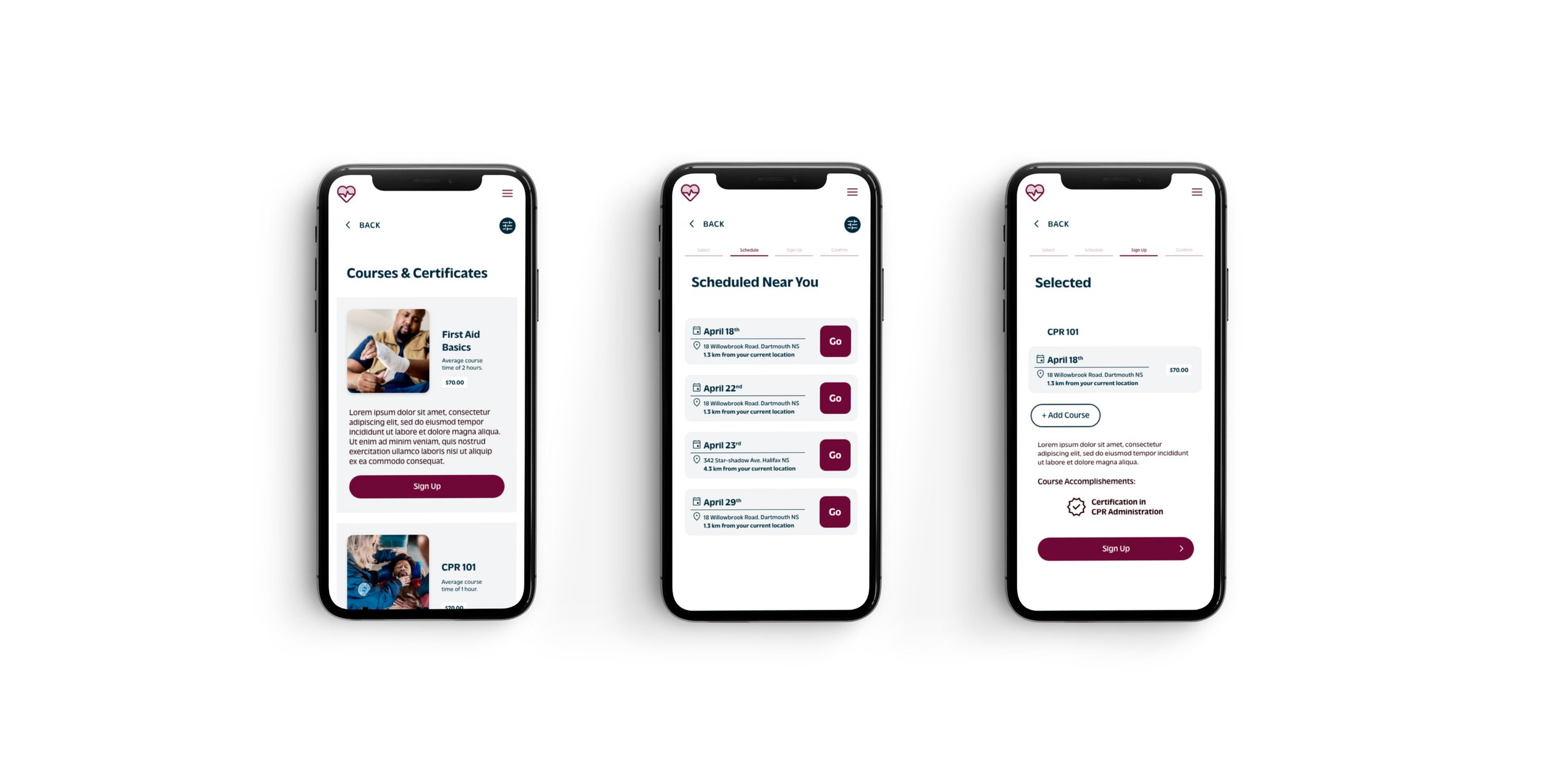
This project was completed in the context of a Google UX Certificate. It includes both a responsive website and dedicated app that allows users to sign up to emergency health and wellness courses making them more informed, practiced and ready to help anyone in need.
As the UI/UX designer for this project, my role included conducting empathy-focused research, paper and digital wire-framing, low and high-fidelity prototyping, conducting usability studies, accounting for accessibility, iterating on designs, determining information architecture, and responsive design.
The Problem
Many people receive training to provide emergency assistance to someone in need. Unfortunately, the majority of these people do not recall or lack the confidence to help someone in need when they are faced with a real life situation.
The Goal
To help more people have quick access to knowledge and feel more confident about their emergency health skills by providing a platform to learn, practice and guide users through an emergency situation.
Personas
Upon delving into research, I uncovered that the older demographic ought to be the primary focus, given their increased vulnerability to emergency situations and the impact on those around them.
To foster a more empathetic understanding, I opted to create personas. I developed two personas specifically for this project, employing them as a tool to humanize the user experience. These personas significantly influenced design choices at every stage of the project.
-
Richard is a 62 year old auto mechanic who needs reminders on how to conduct CPR on bystanders even though he has not practiced in years and would likely need to be guided through the process if the moment were to arise.
-
Judie is a 57 year old grocery store manager who needs reminders on how to properly conduct CPR despite her lack of confidence due to the fact that she was trained many years ago and does not remember all the steps and details.
Competitive Audit
Conducting an audit made it clear that there are many competitors in this field however, there is no competitor that caters specifically to the older generations (50 years and up).
For access to the full competitive audit click here.
Important Realization
Through the research process, it became apparent that I needed to tackle the user problems from two different angles.
Core Goal #1
Create a dedicated app that will guide someone through the process of providing emergency medical care to someone in need.
Core Goal #2
Create a responsive web platform where users can learn and practice emergency medical care.
Dedicated Mobile App
First, let’s tackle Core Goal #1
Initial Brainstorming and Wireframes
By using Crazy Eights to generate a wide range of ideas and then wireframing to explore and refine those ideas, I was able to quickly iterate through multiple design concepts and arrive at a strong final concept. This approach saved time and ensured that the final design met the needs of the target users.
To validate my progress, I conducted usability tests using the lofi prototype with four participants aged 50 and above. This observational study yielded new insights and prompted revisions in the project based on the acquired insights.
Lofi Prototype
Insights & Actions Taken
-
I reduced much of the text and removed anything that was superfluous.
-
I condensed some steps to help avoid excessive clicking or scrolling.
-
I added a search bar to allow for people to use keywords to find the right solution path depending on the emergency situation at hand.
FINAL PROTOTYPE
Dedicated Mobile App
Responsive Web Platform
Next, let’s tackle Core Goal #2
Core Goal #2
Create a responsive web platform where users can learn and practice emergency medical care.
LoFi Prototype
Once again, I tested the LoFi prototypes on the four participants who fit the requirement of being 50 years old and above. This was an unmoderated research study. I wanted to focus on the flow that users would be taking when signing up for a course.
In order to ensure that the prototypes were consistent in achieving the same goal, I created LoFi prototypes for each platform.
Insights & Actions Taken
-
I added a Test Your Knowledge section in the homepage where users have access to practice quizzes.
-
I added a progress bar to the sign up flow. This will allow users to move back and forth more easily.
-
Within the course sign up flow, I added a button that will allow the users to select more than one course at a time.

A very important step: ensuring that this site responsive and accessible through a variety of platforms.
From Large to Small
FINAL PROTOTYPE
Responsive Web Platform
Accessibility Considerations
The buttons are larger than average and consistently styled. The decision to do so was made because many people in the target age range (50+ years) have difficulty reading small print.
This app and responsive website will have screen reading capabilities to allow for users with severe vision impairment to still be able to have access.
The selected colour pallet was verified by WebAIM to ensure strong contrast and maximal legibility.
Closing Thoughts
Impact
Users expressed genuine belief in the app's potential to be helpful in times of need. A noteworthy quote from user feedback captures this sentiment:
"If everyone in the world had this app, the world would be a safer place."
Key Insights
Through this experience, I gained a deeper understanding of the importance of competitive auditing. Examining existing solutions for similar problems proved to be a valuable approach for making informed and efficient design decisions.
Furthermore, leveraging preexisting solutions often leads to an improved user experience, as users are already familiar with these design solutions.


